As a data analyst, I’ve always been driven by the thrill of transforming raw data into actionable insights. But when I was tasked with creating a comprehensive Health and Safety (H&S) dashboard in Power BI, I knew I had the opportunity to create something truly impactful. This project wasn’t just about building a dashboard – it was about creating a tool that could potentially save lives and improve workplace safety. In this article, I’ll take you through my step-by-step process for designing and building an effective H&S dashboard, from defining objectives to deployment and maintenance.
A. Dashboard Design Process
1. Define Objectives and Requirements
- Stakeholder Engagement: Meet with safety officers, HR, management, and other stakeholders to understand their needs.
- Key Metrics and KPIs: Identify key health and safety metrics, such as:
- Incident and accident rates
- Lost Time Injury Frequency Rate (LTIFR)
- Near-miss incidents
- Safety compliance rates
- Days without incidents
- Training completion rates
- Hazard reports
- User Roles and Permissions: Determine who needs access to the dashboard (e.g., safety officers, managers, employees) and define access levels
2. Design Planning
- Dashboard Layout: Plan the layout considering different sections for incidents, compliance, training, and trends.
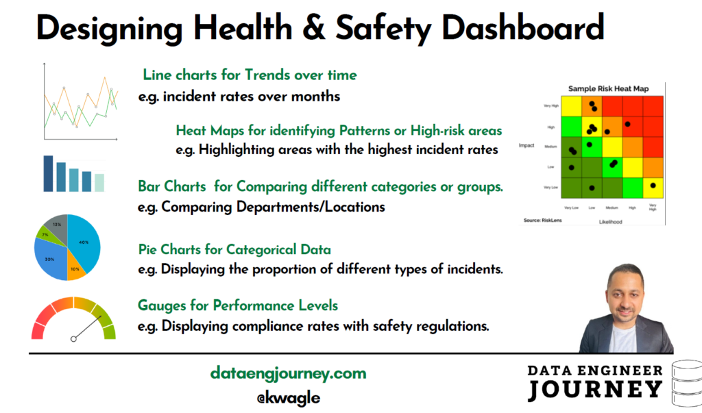
- Data Visualization Choices: Choose appropriate visualizations:
- Line charts for trends over time (e.g., incident rates over months)
- Bar charts for comparing departments or locations
- Pie charts for categorical data (e.g., types of incidents)
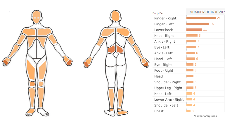
- Heat maps for identifying high-risk areas
- Gauges for compliance rates
- User Experience (UX): Ensure the dashboard is easy to navigate and intuitive, with clear labels and instructions.
3. Data Preparation in PowerBI
- Data Import: Identify and connect to various data sources (databases, Excel files, cloud services, etc.).
- Data Modeling: Create relationships between datasets (e.g., incidents, training records, employee data).
- Calculated Columns and Measures: Define necessary calculated fields, such as:
- Incident rate = (Number of incidents / Total workforce) * 1000
- LTIFR = (Number of lost time injuries / Total hours worked) * 1,000,000
4. Building the Dashboard
- Create Visualizations:
- Incident Trends: Use line charts to show the trend of incidents over time.
- Incident Types: Use pie charts or bar charts to show the breakdown of incident types (e.g., slips, falls, machinery accidents).
- Department Comparison: Use bar charts to compare incident rates across different departments or locations.
- Compliance Rates: Use gauges or bar charts to show safety training compliance rates.
- Near-Miss Reporting: Use a heat map to show areas with high near-miss reporting.
- Arrange Layout:
- Top Section: Key metrics (e.g., total incidents, LTIFR, days without incidents).
- Middle Section: Detailed visualizations (incident trends, types, departmental comparisons).
- Bottom Section: Compliance rates, near-miss reports, training completion.
- Filters and Slicers: Add filters for date ranges, departments, incident types, etc., to enable users to drill down into specific data.
- Interactivity: Enable cross-filtering between visualizations for deeper data exploration.
5. Testing and Validation
- Accuracy Check: Ensure all calculations and data representations are accurate.
- Performance Testing: Check the dashboard’s performance, especially with large datasets.
- User Testing: Conduct user testing sessions with actual stakeholders to gather feedback on usability and functionality.
6. Iteration and Refinement
- Feedback Implementation: Incorporate user feedback to refine visualizations and improve user experience.
- Aesthetic Enhancements: Adjust colors, fonts, and layout for better visual appeal and readability.
7. Deployment
- Publishing: Publish the dashboard to Power BI service, ensuring it’s accessible to all intended users.
- Access Control: Set up role-based access control, so users only see data relevant to their role.
8. Training & Documentation
- User Training: Provide training sessions for end-users to ensure they can navigate and utilize the dashboard effectively.
- Documentation: Create user guides and documentation outlining how to use the dashboard, interpret the data, and handle common issues.
9. Monitoring & Maintenance
- Regular Updates: Schedule regular updates for the dashboard data to ensure it remains current.
- Performance Monitoring: Continuously monitor the dashboard’s performance and make optimizations as needed.
- User Feedback: Maintain an open feedback loop with users to gather ongoing feedback and make iterative improvements.
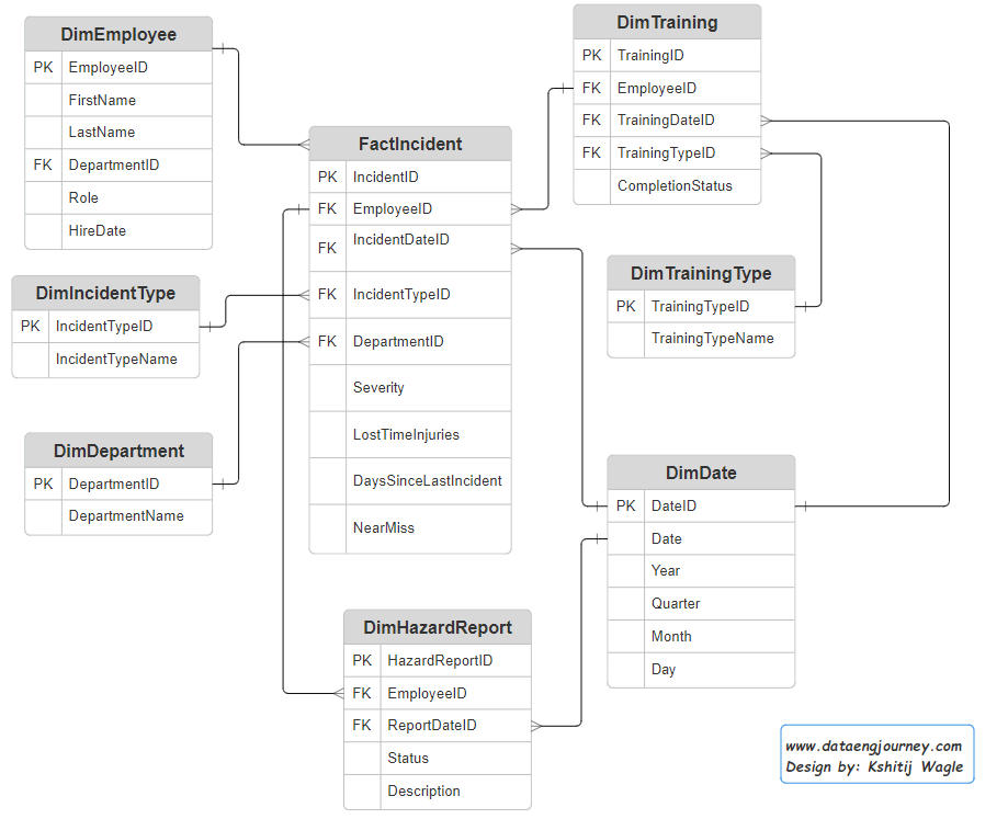
B. Relationships and Cardinality Guides
| S.No | From Table.Column | To Table.Column | Relationship Description |
|---|---|---|---|
| 1 | FactIncident.EmployeeID | DimEmployee.EmployeeID | Many incidents can be reported by one employee |
| 2 | FactIncident.DepartmentID | DimDepartment.DepartmentID | Many incidents can occur in one department |
| 3 | FactIncident.IncidentTypeID | DimIncidentType.IncidentTypeID | Many incidents can belong to one incident type |
| 4 | FactIncident.IncidentDateID | DimDate.DateID | Many incidents can occur on one date |
| 5 | DimTraining.EmployeeID | DimEmployee.EmployeeID | Many training records can belong to one employee |
| 6 | DimTraining.TrainingDateID | DimDate.DateID | Many training sessions can occur on one date |
| 7 | DimTraining.TrainingTypeID | DimTrainingType.TrainingTypeID | Many training sessions can belong to one training type |
| 8 | DimHazardReport.EmployeeID | DimEmployee.EmployeeID | Many hazard reports can be submitted by one employee |
| 9 | DimHazardReport.ReportDateID | DimDate.DateID | Many hazard reports can be submitted on one date |
C. Other Important Factors to consider
- Relevance to Stakeholders: Ensure the dashboard provides actionable insights tailored to the needs of safety officers, managers, and employees.
- Real-Time Data: If possible, integrate real-time data to provide the most up-to-date information. e.g. Incremental refresh every 1 hours.
- Performance Optimization: Optimize the data model and queries to ensure the dashboard loads quickly. This can include techniques like query folding, aggregations, and using DirectQuery where appropriate. e.g. Using a single SQL Connection String/ Indexing in ETL Process.
- Clarity and Simplicity: Use clear and simple visualizations to avoid overwhelming users with too much information.
- Consistency: Maintain a consistent look and feel throughout the dashboard for ease of use.
- Use consistent color schemes, fonts, and design elements across the dashboard. Separate color codes for separate Modules.
- Highlighting Critical Information: Use visual cues (e.g., color coding) to highlight critical information such as high-risk areas or non-compliance.
- Accessibility: Use online color simulator tools. Colors to Avoid:
- Red-Green Combination: Many people with color blindness struggle to differentiate between red and green. Avoid using these colors as the sole means of conveying information or distinguishing elements.
- Subtle Color Differences: Avoid relying solely on subtle differences in color to convey meaning, as individuals with color blindness may not be able to perceive these distinctions.
- Documentation and Training
- Documentation: Provide documentation or a help guide that explains how to use the dashboard and interpret the data. e.g. create data dictionary,
- Training: Offer training sessions for users to ensure they can effectively use the dashboard and leverage its full capabilities.
- Compliance and Security
- Data Security: Ensure that sensitive data is protected and that the dashboard complies with relevant data protection regulations (e.g., Australian Privacy Act).
- Access Control: Set up appropriate access controls to ensure that only authorized users can view or interact with the dashboard.
Conclusion
Looking back on my journey, I realized that creating a successful Health and Safety dashboard wasn’t just about technical skills or data analysis – it was about understanding the needs of the people who would be using it. By putting myself in their shoes and focusing on simplicity, clarity, and performance, I was able to create a tool that would make a real difference in the lives of those who matter most. This experience taught me that data analysis isn’t just about numbers and charts – it’s about people, and the impact we can have on their lives. I hope that my story will inspire you to approach your own projects with the same passion and purpose.
Discover more from Data Engineer Journey
Subscribe to get the latest posts sent to your email.